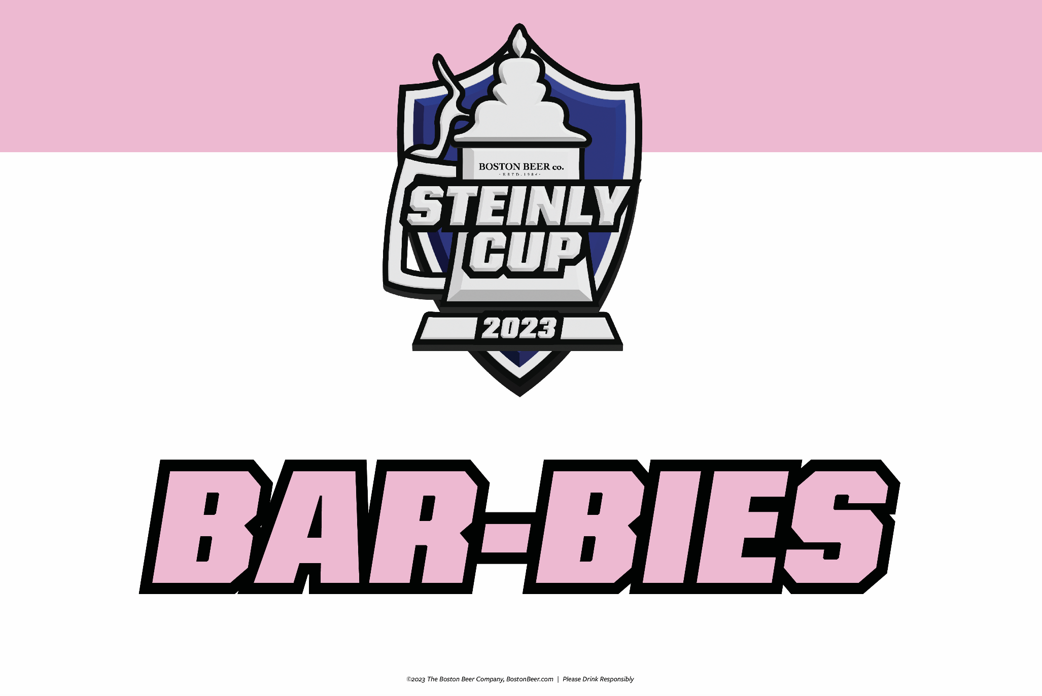
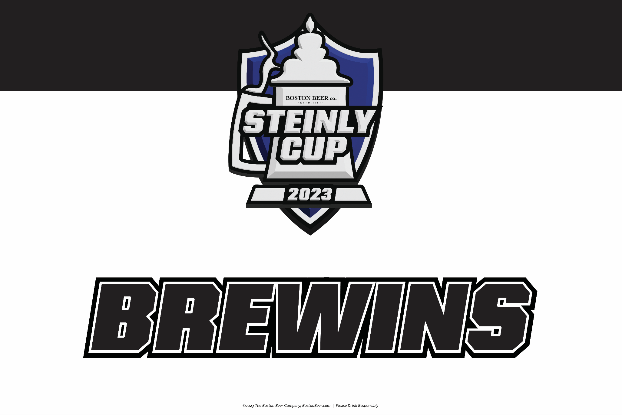
STEINLY CUP LOGO DESIGN
logo design, illustration | aug 2023The Steinly Cup is a game played at the Boston Beer Company annual company-wide meeting, Beerfest. The game serves as a team bonding exercise and involves beer trivia, and other small beer-related challenges such as stein hoisting. The brief for the logo that I received was that they wanted to play off the name of the event by combining elements from previous Stanley cup logos with our traditional stein form. Overall the goal was to design a playful and unique logo, that still aligned with the company’s brand.
©2024 The Boston Beer Company, Boston, MA. All rights reserved.
Artwork designed exclusively for The Boston Beer Company under a work for hire. All rights, title and goodwill remain the property of The Boston Beer Company and use of the artwork is limited to designer’s portfolio only.
FINAL ASSESTS
Adobe IllustratorHere is final logo that I designed, as well as the assets I created to be used alongside it.


PROCESS
Inspiration
The initial prompt that I received from the client was to create a logo that uses elements from previous Stanley Cup logos and features a stein. As inspiration I used a few different Stanley Cup logos shown below. Some reocurring elements that I noticed across almost all of the Stanley Cup logos included: some kind of shield form, minimal colors (typically silver, black, and maybe a dark blue or red), strong and italicized typefaces, and bold, black outlines. My goal was to incorporate these elements into the logo design while remaining on brand and unique.First Iteration
For my original designs, I focused on created a simple logo that embodies the essence of the Stanley Cup logos above through typography and the illustration style. The client liked the concept of the logo but thought that the space in middle of the logo seemed too large and empty in every version.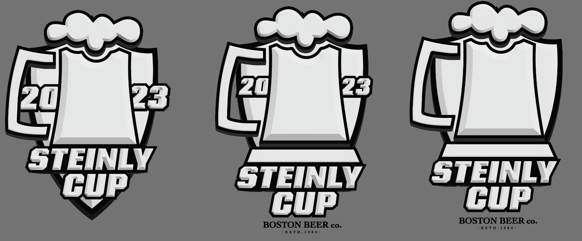
Second Iteration
Based on feedback from the previous iteration, I decided to move the main copy to the center and make it slightly larger so that it really stands out. The client additionally wanted to add some color, so I made a few options that used minimal color because the Stanley Cup logos are mainly silver.
